Archive for the ‘Martin Rowson’ Category

Great Cartoon…

December 15, 2008

I know this one’s a few days old, but I just have to mention it as it’s one of my favourite cartoons of the year.
Martin Rowson on the decision to have another Irish referendum on the Lisbon Treaty.
It’s such a dull (or should that be complicated) subject in many ways, but the cartoon puts it brilliantly.
The caricature of Jose Manuel Barroso is superb, and the Irish character is excellent in its simplicity. The expressions are wonderful. The sweat on the Irishman’s face after throwing up is a great touch.

Most of all though, there’s great comedy timing.
I’ve looked at it again and again, and it still makes me laugh.

Excellent stuff.

A Rowsonian Christmas…

December 2, 2008

The Guardian continues with the tradition of offering Christmas Cards by Martin Rowson, which their readers can print out. This year they are particularly great I think. Lovely drawings, as you would expect, but even better gags.

Go print.

Martin Rowson on a Monday…

September 1, 2008

Stunning image and good gag in today’s Guardian.

Rapid Fire…

July 20, 2008

Great photograph of Gordo arriving in Baghdad on a Puma helicopter. Number 10 press officers were apparently less than happy about it, so much so that they tried to stop it getting published. Fat chance.

It’s almost too good to be true, as far as cartooning goes. Or maybe too good to be effective, as it is such a funny image in itself. It lends itself well to a label-cartoon though. I scribbled the one below when I saw the picture yesterday, thinking I might use it in one way or another today.


©morland

UPDATE:
Martin Rowson used the image nicely for his cartoon in today’s Guardian.
As did Christian Adams, before anyone else, in the Sunday Telegraph.

New Yorker rolls on…

July 15, 2008

Christian Adams has written a thoughtful analysis of the New Yorker cartoon, for the Telegraph.

He expands on the context issue which he mentions in the comments to my previous post on the subject, and it’s well worth a read.
It’s a good argument in many ways, but it seems to me a rather defeatist one in the end. He makes a valid comment that the reason for the entire row is confusion of message and context. That is undoubtedly right. However what comes next troubles me:

As a stand-alone image on the web, it really could be some Right-wing website or magazine’s propaganda. But it doesn’t really matter – it’s a cartoon of Obama worshipping anti-American terrorism. Take it how you want to. The uncomfortable truth is that, outside of its context, this cartoon doesn’t work

That last line makes me think: “So what?”
Isn’t saying that the cartoon doesn’t work out of context because non-New Yorker readers might not get the irony, a bit like me saying that Le Monde is a rubbish newspaper because my French is poor – AND it writes about an awful lot of stuff that those of us who live in England frankly don’t care about?

To say that the cartoon doesn’t work out of context, surely is just an artificial way of justifying unwarranted criticism of a perfectly decent bit of work…isn’t it?
Remember, it’s a cover cartoon. Commissioned by The New Yorker. To go on the front of the magazine. So why should it be judged as anything else?

It is defeatist argument because it implies that all cartoonists – in the three second window we have to grab the reader – should go for the lowest common denominator in order to convey something everyone understands.

We can’t always measure quality against popular appreciation.
We should aim to make our work accessible, yes, but the quality of a cartoonist’s work is not diminished because people who don’t watch much news – but happen to come across a cartoon online – don’t get it!

It might be that Christian has only set out to explain why we’re debating this, and not much else. But with the headline stating quite categorically that “The New Yorker Obama cartoon is a failure,” he is lowering the bar awfully far, for what can be deemed a success!

UPDATE:

Read Guardian cartoonist Steve Bell’s take on the cartoon here.

For a more comprehensive analysis of the entire affair, read..er..Guardian cartoonist Martin Rowson’s article here.

Martin Rowson and the Wet…

June 30, 2008

There’s something about Martin Rowson and water. It makes for stunning cartoons! (see old post)

Today’s piece is probably one of the most brilliantly painted of all. Gordon as a fully emerged shipwreck, seen from above the surface of the water.
Superbly executed.

Ken Sprague Cartoon Competition…

June 25, 2008

The winner of the Ken Sprague International Political Cartoon Competition 2008 was chosen yesterday. The title of the competition this year is Earthworks.
The jury included representatives from various newspapers, among them cartoonists like Martin Rowson of the Guardian and myself.

Given the mix of opinionated jury members, most had expected fierce fighting before a winner was finally found, but the process was surprisingly amicable. Naturally there was some vigorous tussling as the selection gradually narrowed down, but I’m glad to say that a very worthy winner was selected by a (healthy) majority vote.

The result will be announced on July 1st.
More about the winner then…

Go see:

January 21, 2008

Superb cartoon by Martin Rowson in today’s Guardian. 

Political Cartoon of the Year Awards…

December 6, 2007

Political Cartoon of the Year Awards.Presented this year by a highly amusing Ken Clarke.

Steve Bell won cartoonist of the year – deservedly so.
Martin Rowson won cartoon of the year – which again undoubtedly was the right decision.

After a long collaboration with the Economist, the awards this year had been moved to the the Guardian’s gallery in Farringdon Road.
When the Economist was hosting it, much was made of the fact that (the in my mind excellent Economist cartoonist) KAL, seemed to pick up rather a disproportionate amount of awards for best cartoon, so when the Guardian cartoonists collected the main two awards in Farringdon Road, well…you could’ve been forgiven for thinking that there were Labour-like activities going on there too.
However, Martin, with characteristic wit, disarmingly made the connection in his acceptance speech, and fortunately for Steve and him and the credibility of the awards, the prizes were thoroughly deserved.

I proudly won the so-called Gillray Goblet – the runner-up prize for best cartoon, and Dave Brown got an honourable mention for his Rouges Gallery work.

A good night was had by most.

From the Cartoon Notebook: Editing…

October 5, 2007

Michael Gove
©morland

It’s always sad to see the conferences come to an end.
No really.
As mentioned in previous posts, it’s a great chance for cartoonists to study the politicians more closely and develop their caricatures.

The sketch above is of Michael Gove, who I’ve always found quite difficult to draw despite his wonderfully peculiar looks. It’s a bit like with Ken Clarke. There’s too much to pick up on! In Gove’s case it doesn’t help that his voice is even funnier than his appearance, which somehow leaves you trying to draw sound.
And if that wasn’t enough, he’s deviously followed Jack Straw’s lead and ditched his trademark glasses, revealing eyes that are only half the size of those he used to present.

Fortunately though he’s got lips that can pout for England, and when Gove becomes just a tad more famous, those alone should be able to carry a caricature.

Michael Gove simplified
©morland

The best caricaturists have always been those who can capture that one line or feature that tell the whole story, so to speak. I wouldn’t count myself among them, as I tend to elaborate and then elaborate some more. It’s a confidence issue more than anything else, and I hope I’m getting better at it. This applies to cartooning in general as well. How you compose your image – and how you edit it.

The multi-award winning cartoonist Mike Tombs, originally from Coventry in England, has been one of Norway’s most successful, controversial and misunderstood cartoonists for three decades. Outside Norway his work has appeared in Punch, New Statesman and the Observer among others…
(Frustratingly, because I have a feeling he’s now retired and his signature is ‘Mike’ it’s an absolute nightmare trying to find examples of his work to show, so you’ll just have to take my word for it.)

He is a well art-educated craftsman yet readers would often, after screaming “outrage” at his controversial and usually vicious dig at anyone and anything, follow up with an attack on his drawing skills. Failing to understand of course, that had the drawing not been done in such a naive, limited and superbly direct style, their reaction to its message would probably not have been so strong.

I interviewed him once and got a first hand look at how he did it. On his desk were maybe five, six different versions of the same cartoon.
The initial idea was full of detail, the others progressively sparse – ending up with a finished cartoon taking you straight to the point in the most effective and penetrating way.
I try to keep his example in mind when I do my own work, but it’s much harder than it looks.

The introduction of colour to newspaper cartoons adds to that editing challenge. Using a palette which is as concidered as the ‘one line cariacture’, is key, but again it takes confidence to say “he’s suit was grey, but I might paint it red” (to use a poor example) when you’re up against a deadline.

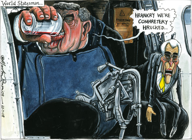
I’m not saying that a cartoon can’t be successful if it’s detailed. There are plenty of examples of cartoonists who can carry it off. Martin Rowson is one example.
There are different styles of storytelling. You might want to lead your readers into the cartoon gradually, with several ‘plots’ and ‘sub plots’, or you might want to hit people between the eyes before they have a chance to defend themselves.

The point is editing.
Editing out the unnecessary information. The objects, colours and text that does nothing but detract from what you’re trying to convey.

I have a long way to go, but I’m working on it…